// Indicator Manual
Market Depth Heatmap
Read historical order-book liquidity as a broad contextual layer behind price to spot institutional support and resistance.
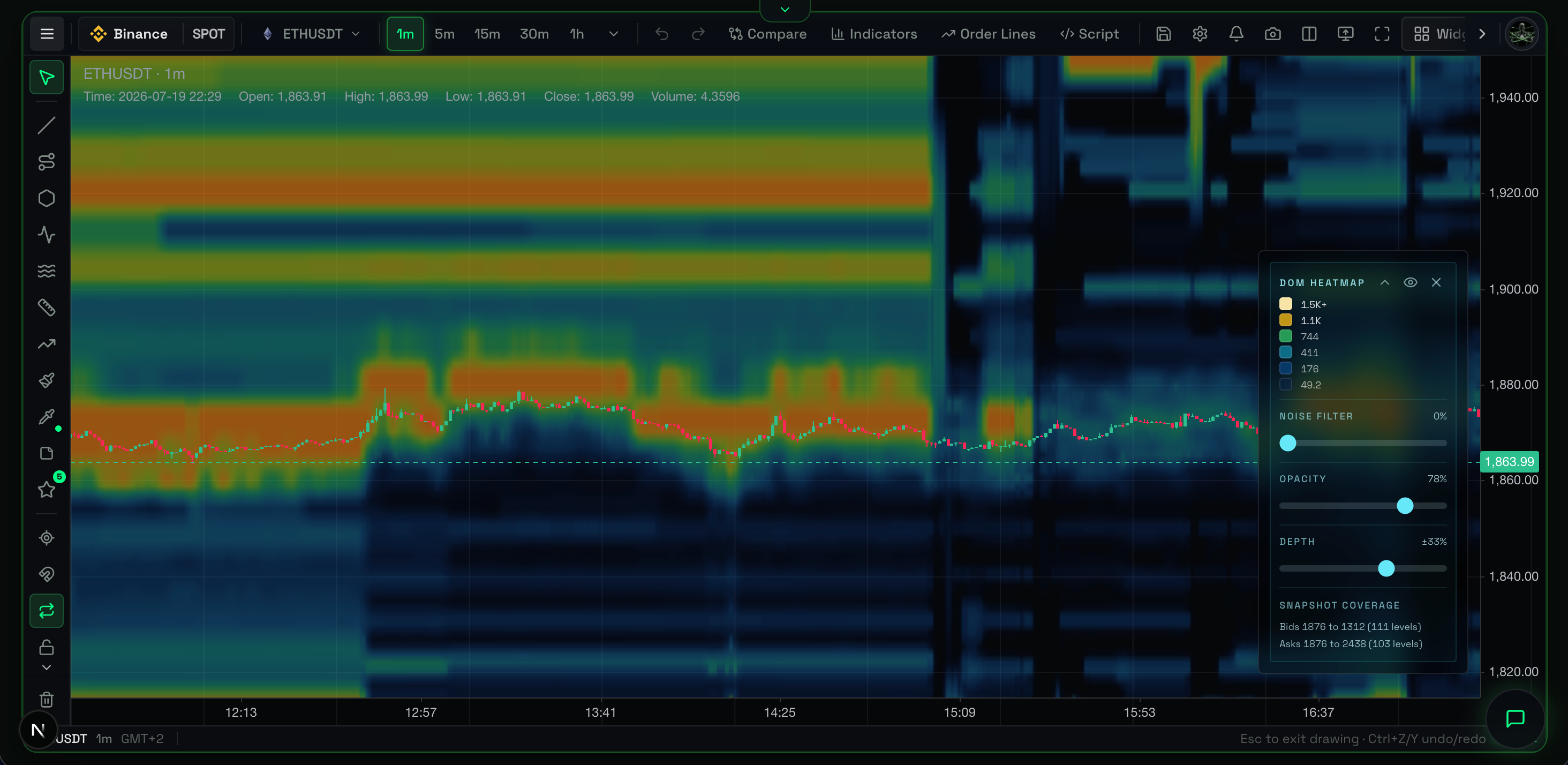
Overview
The Market Depth Heatmap is a visual record of the entire order book (limit orders) plotted over time. It sits behind the candlestick chart, showing exactly where massive walls of liquidity rest historically, and how market makers adjust those walls as price moves.
What It Shows
Instead of a static snapshot of the order book (like a traditional DOM), the Heatmap tracks limit orders across the X-axis (time).
- Bright Yellow/White Bands: Massive concentrations of resting limit orders (thick liquidity).
- Dim Red/Dark Bands: Areas with very few limit orders (thin liquidity).
- Bands Above Price: Resistance walls (Asks/Sellers).
- Bands Below Price: Support walls (Bids/Buyers).
Why It Matters
Institutional players (whales) use massive limit orders to build positions or defend price levels. Because their orders are large, they leave a glowing, persistent trail on the Heatmap. By tracking these bright bands over time, you see if big money actively tries to push the price up (by stacking bids below price) or cap the price (by stacking asks above).
How to Read It
- Price bounces off a bright band: True support/resistance. The limit wall absorbed the market orders.
- Bright band suddenly disappears before price hits it: "Spoofing." A market maker placed a fake wall to scare retail, then canceled it.
- Price slices through a dim area quickly: Price moves fastest through areas of low liquidity because there are no limit orders to slow it down. This is a "liquidity vacuum."
- Bright bands moving with price: When price goes up, and bright bands below immediately move up to trail it, market makers actively support the trend.
Practical Use Cases
- Identifying True Support/Resistance: Standard charts use historical highs/lows for support. The Heatmap shows actual money resting in the market right now. Trade off the bright bands, not invisible lines.
- Spotting Spoofing: A massive bright band above price might scare you from going long. But if you watch the Heatmap and that band disappears the moment price gets close, the resistance was fake. This is a highly bullish signal.
- Playing the Vacuum: If price breaks through a major liquidity wall, look at the Heatmap directly above it. If the area is dark red/dim, there is zero resistance. The price likely teleports to the next bright band.
Example Scenario
Bitcoin breaks out of a consolidation pattern and starts rising fast. You look at the Heatmap and see a blindingly bright yellow band resting precisely at $65,000. It sat there untouched for three days. You hold your long position but set take-profit slightly below the band at $64,950, knowing this massive wall of sell orders will be incredibly difficult for buyers to chew through on the first attempt.
Common Mistakes
- Assuming walls cannot break: A bright band is strong resistance, but if aggressive market buyers (CVD) are strong enough, they chew right through the limit orders.
- Ignoring spoofing: Never blindly trust a wall. Be prepared for the wall to be pulled (canceled) at the last second.
Limitations
- The Heatmap is visually heavy. It requires practice to read without feeling overwhelmed.
- It is a record of passive limit orders, which represent intentions, not actual executed trades.
- It does not tell you who placed the orders, only that they exist.
Related Indicators
- Liquidity Depth: The same underlying data, but viewed as absolute metrics and distance bands rather than a heatmap.
- Footprint Chart / CVD: Use the Heatmap to find passive liquidity walls, and use Footprint to see if aggressive market orders actually absorb that wall.
For Advanced Users
Asset Class Context
Passive liquidity is generally thickest in the Spot market because market makers must warehouse real assets. Therefore, the Market Depth Heatmap intentionally pulls data from the Spot market order book, even if other flow indicators (like Footprint or CVD) read Futures data.