// Indicator Manual
Correlation Overlay
Compare the main chart against related symbols using a normalized percentage-change overlay.
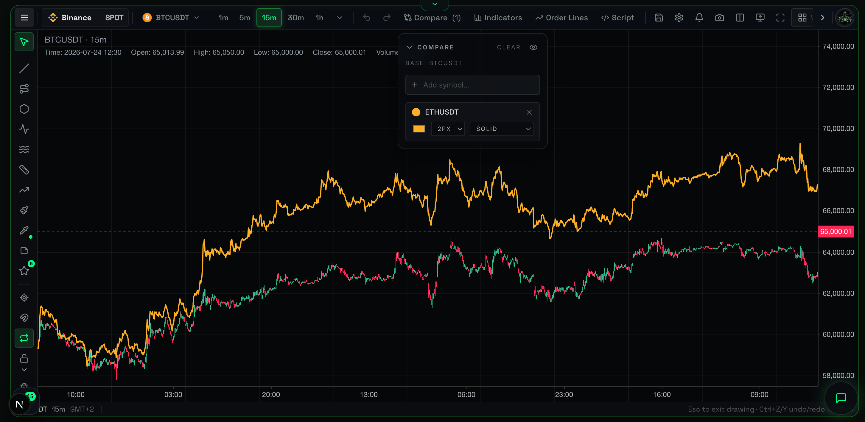
Overview
The Correlation Overlay is a relative performance tool that compares the price action of your main chart against one or more reference assets. By normalizing all charts to a shared percentage scale, it reveals which asset is leading, lagging, or diverging during a specific market window.
What It Shows
Instead of plotting raw prices (which makes it impossible to compare Bitcoin at $60,000 to Ethereum at $3,000), this tool mathematically "rebases" all visible lines to a shared 0% starting line at the extreme left of the screen.
As time progresses across the visible chart:
- Base Symbol Line: Percentage performance of your current active chart.
- Compare Symbol Lines: Percentage performance of the reference assets.
- Percentage Scale (Right Axis): Shows exactly how much each asset gained or lost relative to the start of the visible window.
Why It Matters
Money constantly rotates between sectors and assets. During a bull run, not everything pumps at the same time. By identifying which asset shows "relative strength" (pumping harder and dumping less), you find market leaders offering the best long opportunities and avoid laggards.
How to Read It
- Line is above the others: This asset is the strongest performer over the visible period (Relative Strength).
- Line is below the others: This asset is the weakest performer (Relative Weakness).
- Lines are moving together: The assets are highly correlated; they are driven by the same macro market forces.
- Lines are crossing: Capital is rotating from the previous leader into the previous laggard.
Practical Use Cases
- Spotting Relative Strength (Leading Assets): If Bitcoin drops 5% but Ethereum drops only 1%, Ethereum shows relative strength. When the market recovers, Ethereum will likely pump harder than Bitcoin.
- Pair Trading / Hedging: If you long a strong altcoin, simultaneously short a weak altcoin (the laggard on the overlay) to hedge against broad market crashes.
- Spot vs. Futures Divergence: Overlaying the Spot chart on top of the Perpetual Futures chart reveals subtle pricing inefficiencies driven by extreme funding rates.
Example Scenario
You look at the SOL chart and decide whether to go long. You add BTC to the Correlation Overlay. Suddenly, BTC drops sharply, printing a massive red candle. On the overlay, the SOL line barely dips and stays flat. This confirms massive passive buying pressure on SOL. As soon as BTC stops dropping, SOL rockets upward, proving it was the stronger asset.
Common Mistakes
- Zooming in/out changes the context: The overlay resets the
0%baseline based on the very first candle on your screen. Scrolling or zooming changes the starting point and alters the percentage returns. Always track your visible timeframe. - Confusing it with statistical correlation: A line moving up while another moves down means they diverge in performance, not that they have a negative Pearson correlation coefficient over a long timeframe.
Limitations
- It is purely a visual relative-performance overlay, not a mathematical statistical correlation tool.
- The reading depends 100% on your visible window. A coin might be up 10% on the weekly view but down 5% on the daily view compared to BTC.
Related Indicators
- CVD (Cumulative Volume Delta): Check if the asset showing relative strength is actually being aggressively bought (high CVD) or just artificially held up by passive limit orders.
For Advanced Users
Normalization Math
Every time the chart is panned or zoomed, the renderer finds the first visible timestamp on the X-axis. It takes the closing prices of all active symbols at that exact timestamp and sets them as the 1.0 (or 0%) baseline. Every subsequent candle is plotted as ((CurrentPrice - BasePrice) / BasePrice) * 100.